|
|
Also please check out my second blog, The Painting Archives to see older (pre-2004) paintings for sale.
Wednesday, February 27, 2008
A. Leavitt Crowell, 1922-2000
 Today I'm remembering and missing my father, who died eight years ago today...the following is excerpted from the eulogy I gave at his memorial service, and speaks to the profound influence a parent can have on a child's way in life.
...I have a black and white photograph, taken outside on a suburban lawn, of my dad and I in 1957. We are flying a kite—you can’t see the kite, but you can see the string extending off to the left. My dad is staring upward, presumably at the kite, and I’m watching the string. This picture strikes me as a metaphor for our relationship and the kind of father he was...I’m the one holding the kite string, all by myself, even though I’m only 2 and ½. No doubt, from my expression, I’m fascinated by the way the string is moving and pulling on my hold, and the sense of power and control over the kite that I’m feeling. My dad is not hovering over me, needing to have his hand on the string—instead, he’s slightly over to the side, gazing at the kite in the sky, the outcome of our little project, and he looks pleased.
In just this way he offered support and encouragement, but never stifling over involvement, or insistence on managing things in the decisions and undertakings of my life. In doing so, he gave me a sense of confidence and belief in my abilities that I would find my own way.
...My path as an artist was one with which he was totally unfamiliar. But true to form, he, along with my mother, supported my interest early on with materials, lessons, and museum visits, and later he encouraged me in my formal education. Dad always took my art work seriously, made an effort to understand it, and rejoiced in my successes. In recent years he made some very insightful comments about my paintings, which surprised and pleased me, coming from a man, who in his own words “couldn’t draw a straight line.”
...His philosophies, when expressed, were simple and direct. One day when I was about ten I was crying about bad things that had happened to me at school and saying it had been a terrible day. He came into my room, hugged me and said, simply, “Always remember this, a day is just what you make it.” And I have remembered it, many times--a statement that was somehow both comforting and challenging.
He was an exceedingly generous man. It used to embarrass me to shop with him because he was so eager to buy whatever he thought would please me. But his generosity was not in material terms only—he was most generous in spirit. A masterful storyteller, a man who laughed loud and long, gave crushing bear hugs, sang off-key sailor songs, a man who welcomed and appreciated many sorts of people, and was never judgmental, who enjoyed (and sometimes cooked) excellent food, and who truly had a zest for life.
¶ 9:42 AM 3 comments

 Today I'm remembering and missing my father, who died eight years ago today...the following is excerpted from the eulogy I gave at his memorial service, and speaks to the profound influence a parent can have on a child's way in life.
 ...I have a black and white photograph, taken outside on a suburban lawn, of my dad and I in 1957. We are flying a kite—you can’t see the kite, but you can see the string extending off to the left. My dad is staring upward, presumably at the kite, and I’m watching the string. This picture strikes me as a metaphor for our relationship and the kind of father he was...I’m the one holding the kite string, all by myself, even though I’m only 2 and ½. No doubt, from my expression, I’m fascinated by the way the string is moving and pulling on my hold, and the sense of power and control over the kite that I’m feeling. My dad is not hovering over me, needing to have his hand on the string—instead, he’s slightly over to the side, gazing at the kite in the sky, the outcome of our little project, and he looks pleased.
In just this way he offered support and encouragement, but never stifling over involvement, or insistence on managing things in the decisions and undertakings of my life. In doing so, he gave me a sense of confidence and belief in my abilities that I would find my own way.
...My path as an artist was one with which he was totally unfamiliar. But true to form, he, along with my mother, supported my interest early on with materials, lessons, and museum visits, and later he encouraged me in my formal education. Dad always took my art work seriously, made an effort to understand it, and rejoiced in my successes. In recent years he made some very insightful comments about my paintings, which surprised and pleased me, coming from a man, who in his own words “couldn’t draw a straight line.”
...His philosophies, when expressed, were simple and direct. One day when I was about ten I was crying about bad things that had happened to me at school and saying it had been a terrible day. He came into my room, hugged me and said, simply, “Always remember this, a day is just what you make it.” And I have remembered it, many times--a statement that was somehow both comforting and challenging.
He was an exceedingly generous man. It used to embarrass me to shop with him because he was so eager to buy whatever he thought would please me. But his generosity was not in material terms only—he was most generous in spirit. A masterful storyteller, a man who laughed loud and long, gave crushing bear hugs, sang off-key sailor songs, a man who welcomed and appreciated many sorts of people, and was never judgmental, who enjoyed (and sometimes cooked) excellent food, and who truly had a zest for life.
¶ 9:42 AM 3 comments
Monday, February 25, 2008
blog website
Some good person must have submitted my blog to this site (click here,) or maybe it just appeared by some incomprehensible internet magic...in any case, if you like my blog you can go on this site and write nice things (please) and with good ratings it will rise to more prominence on the site.
It looks like a fun site to browse, although with over 6,000 art blogs perhaps it is a bit overwhelming. I didn't get past the first page...
By the way, I only discovered this site because I have a "google alert" on my name. It's something Alyson Stanfield recommended awhile ago as a way to keep tabs on where your name comes up, especially on sites you had no idea existed. ¶ 5:41 PM 0 comments
Sunday, February 24, 2008
working on my book
 This is not the final version of my catalog cover--in fact, in posting this working version, I'm hoping to get some feedback, a better title idea, or other critical reactions. For some reason, the cover has caused me more difficulties than other pages, maybe because the cover template options available on www.blurb.com (the site I'm using to create this) are more limited than for the interior pages.
This design seems a bit awkward or clumsy to me...I have no background at all in graphic design and at times I wish that I did!
The rest of the catalog is nearing completion, and looks good. It has really been a fun project. Overall I am very pleased so far with the ease of the process and the options available with the (free) download from blurb.com that you use to create your book.
I'd love blog comments, but please email me (crowellart@yahoo.com) if you'd rather communicate with me that way. Thanks! ¶ 5:25 PM 5 comments
 This is not the final version of my catalog cover--in fact, in posting this working version, I'm hoping to get some feedback, a better title idea, or other critical reactions. For some reason, the cover has caused me more difficulties than other pages, maybe because the cover template options available on www.blurb.com (the site I'm using to create this) are more limited than for the interior pages.
 This design seems a bit awkward or clumsy to me...I have no background at all in graphic design and at times I wish that I did!
The rest of the catalog is nearing completion, and looks good. It has really been a fun project. Overall I am very pleased so far with the ease of the process and the options available with the (free) download from blurb.com that you use to create your book.
I'd love blog comments, but please email me (crowellart@yahoo.com) if you'd rather communicate with me that way. Thanks! ¶ 5:25 PM 5 comments
Wednesday, February 20, 2008
thoughts on scale

February, shown above, is a rather quiet painting, but has enough surface texture to hold up well under the scrutiny I've given it over the past week or so. There are thin, subtle lines and marks in the dark panel that aren't showing up well here.
It's the latest in a series of smaller multiple panel paintings that I've been working on for the past few months. "Smaller" here means 30"x28" (half the size of much of my work.) Several, including Summit and Deep Blue have been featured in previous posts. I like the scale of these--they have presence without dominating a space.
Because I work on all sizes of panel, from tiny 6"x6" to arrangements measuring up to 90" on one side, ideas about scale interest me--regarding my own experience in creating them as well as for the viewer. When I paint something large, I love the sense of being surrounded by the paint...while the challenge is to make something that justifies its own scale. I feel there needs to be something monumental about the piece, that will hold up in its largeness, over time and repeated viewings.
Very small paintings have to be intriguing enough to withstand close-up viewing--to have presence though occupying little physical space. It's really pleasurable for me to give due importance to slight shifts in color or texture, or to a few lines or some interesting mark--and to bring that appreciation to viewers, whose faces will likely be inches rather than feet away from the work.
In between these extremes are paintings such as the one above, medium dimensions. I think the challenge here is to rise above what seems an ordinary or expected kind of scale. To stand out in a world of objects of similar size--not just other works of art, but all the things in ordinary homes and buildings that vie for visual attention--windows, computer screens, furnishings. While this presents a challenge, it's also a strength--this is an accessible scale, that requires no special exhibition space, and feels comfortable to people as an object to contemplate. Issues of scale can be put aside in favor of other considerations. I think I've been avoiding this scale, maybe because of its "ordinariness" but lately it's come back into my work as something worth exploring. More in the works!
February is on its way to Darnell Fine Art in Santa Fe, in time (I hope) for an event on Friday called ArtFeast which brings in many visitors and raises money for art education in the area. I have sent two other new paintings out which have arrived and will be exhibited. If you're in the area please consider attendning this event! ¶ 9:27 AM 5 comments
Sunday, February 17, 2008
very rich hours
 The idea that there are visual patterns, arrangements of colors, or certain compositions that we're drawn to over a lifetime is one that intrigues and mystifies me. Recently my friend Marina Broere mentioned in a blog post that she has been drawn to the work of Mark Rothko ever since she was a child. This made me wonder about what I have found visually compelling over the years and how that might relate to what I do now.
Thinking different artists and kinds of art that I've loved, I soon saw that it would be a big project to identify the consistent threads. As a younger artist, I was all over the place--my preferences were in pretty constant flux. But focusing on just one of these did prove interesting. For my graduation present from high school. I asked for and received from my parents an expensive art book, a reproduction of a medieval illuminated manuscript--Les Tres Riches Heures de Jean, Duc de Berry. (OK, so I was a bit of an art nerd.)
Marina's post and my rambling thoughts led me to pull this book from its dusty slipcover--probably the first time it has been out in 20 years or more. When I was 18 and 19, I used to pore over it with delight. Thirty five years later, what do I see in these images now, and what did I see then?
It's not hard to see why, as a teenager, I'd appreciate the pretty, romantic painting shown here (April, from the calendar in the beginning of the book) --but most of the rest of the book is actually taken up with Biblical illustrations--and given my particular brand of religious upbringing, I had scant knowledge of the meaning and symbolism of Christian imagery. So I think that my interest in all of these was almost purely visual. At the time, I was taken by the rich colors and especially by the tiny detail (this painting measures only about 8"x5") since I was into meticulous pen and ink drawing at the time. These were miniature worlds, exotic and beautiful.
 What do I see in Les Tres Riches Heures today? All of the above, still--but more. What struck me as I paged through my copy, in too many examples to show here, is how much correspondence there is in terms of color, texture and composition to my current work. It's not very obvious perhaps--but here's what I see: bright colors played off against earthy ones, contrasting visual textures, the overall grid-like composition, the use of metallic paint, which I have recently let into my work in subtle ways--even the quiet mood created--all of these are aspects of how I work today.
So, I wonder, was I drawn to these images as a teenager because of some central, inherent idea of what art should look like, and have carried that forward to today, or does it work the other way around--that these particular aspects of my work can be traced back to this early influence, put aside for many years? I suspect it is actually a complex interweaving of the two...neither one nor the other exclusively. And I'm also sure this kind of art/life story is very common among those of us who have been chasing after elusive ideals in our work for years. Visual ideas and attractions can take lots of forms over time..thinking about what may tie them together (and why?) is fascinating. ¶ 12:56 PM 1 comments
 The idea that there are visual patterns, arrangements of colors, or certain compositions that we're drawn to over a lifetime is one that intrigues and mystifies me. Recently my friend Marina Broere mentioned in a blog post that she has been drawn to the work of Mark Rothko ever since she was a child. This made me wonder about what I have found visually compelling over the years and how that might relate to what I do now.
 Thinking different artists and kinds of art that I've loved, I soon saw that it would be a big project to identify the consistent threads. As a younger artist, I was all over the place--my preferences were in pretty constant flux. But focusing on just one of these did prove interesting. For my graduation present from high school. I asked for and received from my parents an expensive art book, a reproduction of a medieval illuminated manuscript--Les Tres Riches Heures de Jean, Duc de Berry. (OK, so I was a bit of an art nerd.)
Marina's post and my rambling thoughts led me to pull this book from its dusty slipcover--probably the first time it has been out in 20 years or more. When I was 18 and 19, I used to pore over it with delight. Thirty five years later, what do I see in these images now, and what did I see then?
It's not hard to see why, as a teenager, I'd appreciate the pretty, romantic painting shown here (April, from the calendar in the beginning of the book) --but most of the rest of the book is actually taken up with Biblical illustrations--and given my particular brand of religious upbringing, I had scant knowledge of the meaning and symbolism of Christian imagery. So I think that my interest in all of these was almost purely visual. At the time, I was taken by the rich colors and especially by the tiny detail (this painting measures only about 8"x5") since I was into meticulous pen and ink drawing at the time. These were miniature worlds, exotic and beautiful.
 What do I see in Les Tres Riches Heures today? All of the above, still--but more. What struck me as I paged through my copy, in too many examples to show here, is how much correspondence there is in terms of color, texture and composition to my current work. It's not very obvious perhaps--but here's what I see: bright colors played off against earthy ones, contrasting visual textures, the overall grid-like composition, the use of metallic paint, which I have recently let into my work in subtle ways--even the quiet mood created--all of these are aspects of how I work today.
 So, I wonder, was I drawn to these images as a teenager because of some central, inherent idea of what art should look like, and have carried that forward to today, or does it work the other way around--that these particular aspects of my work can be traced back to this early influence, put aside for many years? I suspect it is actually a complex interweaving of the two...neither one nor the other exclusively. And I'm also sure this kind of art/life story is very common among those of us who have been chasing after elusive ideals in our work for years. Visual ideas and attractions can take lots of forms over time..thinking about what may tie them together (and why?) is fascinating. ¶ 12:56 PM 1 comments
Thursday, February 14, 2008
me me me
At the risk of sounding like one big ego, my topic tonight is a self-promotional project in the works--a 5-10 minute video of me in my studio. This idea was suggested by the folks at Darnell Fine Art, my gallery in Santa Fe. They are exploring ways to better acquaint visitors with their artists, including a loop of videos which will play on a flat screen TV in the gallery.
Filming was planned for today. I've been sick all week and since I'm still a bit on the shaky side, I was hoping to change that. But my videographer friend, Wade Britzius, lives an hour or so away--and happened to be close by today, so we went ahead. Actually by mid morning I was feeling better, and ended up having a pretty normal day, if normal can include being in front of a video camera most of the afternoon.
But first, a little back story. On one of my more feverish days, with nothing else to occupy me, I came up with some pretty elaborate plans for the video, touching on just about every aspect of Me as Artist. My process, experiences, path of development, it was all there. This Video About Me played quite vividly in my poor sick brain..I got pretty fired up about it. When I felt up to it, I wrote everything down, and printed a bunch of stuff from my blog, website and other files as notes to have on hand.
So Wade and I sat down, me with my pages of notes, and I told him all my great ideas. Wade heard me out and then he said, "you know...I think the idea here, what the gallery is asking for, is just to speak from your heart--engage the viewer emotionally, talk about what you love about your work, and do some painting for the camera." He said that what I proposed would end up being at least a twenty minute film--maybe (was he joking?) a full length documentary unless it was so severely edited that it wouldn't even be worthwhile. That we ought to aim for the short side of 5-10 minutes in order to keep the viewer's attention in a situation (gallery hopping) in which they might have trouble settling in to watch. He said all that very kindly of course.
What was I thinking?? I had to admit he was right, and that the film I imagined was a bit of a fever dream...still it was kind of an interesting one...I'll put it away for some other time, I guess.
We went down to the studio, and I talked about various things with a bit of prompting and a few questions from Wade. He said I sounded quite natural doing that and it's true that I didn't feel especially self-conscious (to my surprise.) No script, just what came to my mind. I also did some work on a panel, with decent results. Painting in front of the camera was not in my original plan, since I thought I'd freeze up. But it was fine. Overall it was a very productive session, loose and easy, and we hope that Wade has all he needs now. He will edit and we'll figure out where to add still photos and music. I'm sure it will be weeks or months before it actually gets done, but one of these days I'll be able to post it here.
This process of sifting through ideas, and the collaborative aspect that came into play was really quite interesting. Starting with ideas that were elaborate, academic, complex and left-brained--and working towards those that were straightforward and honest, and somewhat spontaneous, that will convey some essence of me and my work. Stay tuned. ¶ 7:24 PM 0 comments
Monday, February 11, 2008
new painting
 After an excellent week for painting I have been looking at everything that is done or nearly so, and seeing changes, similarities and directions. This painting, Aerugo (42"x48" oil on panel) is quite similar to Rust, finished a couple of weeks ago. I had actually meant for them to be a diptych, or to join them into one large painting, but this was not to be. They moved in different directions, in spite of color similarities. Aerugo has a more tactile surface, texture formed by paint layers that have not been smoothed over to flat in the way I do with most of my work. I am enjoying the energy of this effect. Rust has a quieter, more meditative feel than this one, but both have intense reds...and maybe meditative isn't the right word...how quiet can red actually be? I've been really enjoying heaping on this vibrant color in contrast to the bleak outdoors.
I also see that I'm moving away from the emphatically vertical compositions of the past year or two, such as recent paintings Ghost and Sanctuary. I still have several of my Vertical series in progress, but most of the other multiple panel works are closer to square. Why this is so, I can only guess that for now I have mined the possibilities of that format. ¶ 1:09 PM 6 comments
 After an excellent week for painting I have been looking at everything that is done or nearly so, and seeing changes, similarities and directions. This painting, Aerugo (42"x48" oil on panel) is quite similar to Rust, finished a couple of weeks ago. I had actually meant for them to be a diptych, or to join them into one large painting, but this was not to be. They moved in different directions, in spite of color similarities. Aerugo has a more tactile surface, texture formed by paint layers that have not been smoothed over to flat in the way I do with most of my work. I am enjoying the energy of this effect. Rust has a quieter, more meditative feel than this one, but both have intense reds...and maybe meditative isn't the right word...how quiet can red actually be? I've been really enjoying heaping on this vibrant color in contrast to the bleak outdoors.
 I also see that I'm moving away from the emphatically vertical compositions of the past year or two, such as recent paintings Ghost and Sanctuary. I still have several of my Vertical series in progress, but most of the other multiple panel works are closer to square. Why this is so, I can only guess that for now I have mined the possibilities of that format. ¶ 1:09 PM 6 comments
Wednesday, February 06, 2008
work in progress
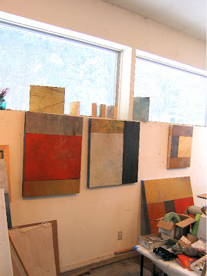 I haven't put up any studio pics in awhile...there's some reluctance on my part to do this, since things change every day. These were taken yesterday and are already old news, as several of these arrangements have gone though big changes since then. But I still enjoy a few freeze frames once in awhile, and they do illustrate a bit about my process.
I've written about this process before on my blog, so if you're a regular reader, just skip ahead to the next paragraph...but if you're new to my work, here is a brief explanation of how I work with my multiple panel paintings. I like to keep the arrangements of panels open-ended and subject to change for as long as possible, so that I can find the most effective compositions. At any one time I have quite a few panels sitting around in various stages, some seem done (but not necessarily--like anything in my studio, they are subject to revision) and others are barely started, with not much more but a color idea in place. I either hang the various arrangements onto the wall (with small nails or push pins...yes my wall board resembles swiss cheese)or clamp the panels together with c-clamps so that they can be moved out of the way. When I finally have what I want in a composition, I remove the blue tape with which I protect the edges of the panel, mark the position of each panel on the back of the painting, and take the whole thing to Carl Brown, my fabulous woodworker guy, for bolts. I am always a bit humbled to realize how much I depend on him for carrying out this essential final step, which he does with tremendous care and attention to detail.
 For the past couple of weeks, I seemed to be slogging through mud, or maybe quicksand, in the studio...but somehow, I've got my traction back and things are going really well. Even my palette has brightened a bit. I have about ten paintings in progress and a few just finished, and I'm really feeling excited about my work. Maybe it is springtime energy? (Um, probably not, as you can see in the view out my studio windows.)
Some of the new ideas I'm working with: interesting grays, paired with saturate oranges and reds...horizontal paintings made up of small panels...more diverse colors within panels...and exploring the effects of metallic and transparent colors in the initial layers of a painting. Not that you can see all of this in these shots, but each is a thread I'm following. I'll have new work to post soon. ¶ 6:59 PM 2 comments
Saturday, February 02, 2008
very cool
Check out Blurb.com if you have ever wanted to self-publish a catalog of your work, or any other kind of book. This is an amazing website that allows you to do just that, using their free software. You design your book page by page using a large array of available templates and options for design aspects. It's really easy to understand and to view as you progress.
When you're done, you can order any number of copies at very reasonable prices (starting at $12.95 for one 20 page copy, plus S/H.) If you think anyone would pay money for it, you can even sell your book from their website without any upfront cost--they print as orders are placed.
I've spent hours today fooling around with ideas for a catalog of my work and having a great time. Non-art applications have come to mind too--how about a cookbook, a travel journal, a family album?? A person could go nuts with this. For now I'm sticking to art topics--with plenty of ideas spinning out from there. For example I could see making one "serious" or "professional" catalog for the galleries, and another one that was more personal or autobiographical. You can even import blog posts into book format with this software... ¶ 4:15 PM 2 comments
Friday, February 01, 2008
size matters
 I've been working on some new small paintings on single panels, and my e-penpal, Patty Oblack asked me in an email about the difference between single panel paintings and those that are done as part of larger compositions. Her question made me think about why I like to do these single-panel paintings (usually they are small to medium-sized)--and about what role they play in my creative process.
In my multiple panel paintings, the energy of the painting comes from the contrasts and complements within the whole composition, so my emphasis is on the way the panels interact and work together. Although I paint each panel individually, with concern for its own integrity, I'm also thinking about what it will offer a larger composition. In the end, I want the multiple panel paintings to be more than the sum of their parts.
In a single panel painting, the energy of the painting, its movement and direction, are all contained within the boundaries of one panel. The way that the eye is directed, the need for emphasis to carry the work must be considered. It is its own little world. This is a different approach for me, more disciplined I think (of course, none of this is a revelation to the majority of painters who work on single panels!) It involves art muscles that I don't wish to let atrophy.
Anyway, I think these small single panels strengthen my compositional skills and awareness--like basic drawing skills, I want to maintain and practice my ability to work this way. Besides, these small paintings also tend to be more immediately rewarding than the big multiple panel works (which involve endless re-arrangements!)and in that way are enjoyable and pleasing to make.
Of course, few things are really straightforward in the art process, and often a panel evolves one way or another, from part of a larger painting to single life, or the other way around. It's all in the mix, and always a challenge!
(The image above is from November, a 6"x6" painting called Structure, included in the recent Gems show at Wilde Meyer Gallery in Scottsdale.) ¶ 10:55 AM 0 comments
 I've been working on some new small paintings on single panels, and my e-penpal, Patty Oblack asked me in an email about the difference between single panel paintings and those that are done as part of larger compositions. Her question made me think about why I like to do these single-panel paintings (usually they are small to medium-sized)--and about what role they play in my creative process.
 In my multiple panel paintings, the energy of the painting comes from the contrasts and complements within the whole composition, so my emphasis is on the way the panels interact and work together. Although I paint each panel individually, with concern for its own integrity, I'm also thinking about what it will offer a larger composition. In the end, I want the multiple panel paintings to be more than the sum of their parts.
In a single panel painting, the energy of the painting, its movement and direction, are all contained within the boundaries of one panel. The way that the eye is directed, the need for emphasis to carry the work must be considered. It is its own little world. This is a different approach for me, more disciplined I think (of course, none of this is a revelation to the majority of painters who work on single panels!) It involves art muscles that I don't wish to let atrophy.
Anyway, I think these small single panels strengthen my compositional skills and awareness--like basic drawing skills, I want to maintain and practice my ability to work this way. Besides, these small paintings also tend to be more immediately rewarding than the big multiple panel works (which involve endless re-arrangements!)and in that way are enjoyable and pleasing to make.
Of course, few things are really straightforward in the art process, and often a panel evolves one way or another, from part of a larger painting to single life, or the other way around. It's all in the mix, and always a challenge!
(The image above is from November, a 6"x6" painting called Structure, included in the recent Gems show at Wilde Meyer Gallery in Scottsdale.) ¶ 10:55 AM 0 comments

